Journey: a series of infographics

A personal infographic booklet that explores the professional, emotional and physical journeys I have taken.  The cover is fragile, and requires the user to  tear it open via a strip, signalling that this is no whimsical calculation of coffee cups and bus trips, but something that requires the user to be engaged.


Poetry Anthology 2015

Connective Tissue is the Anthology for the 2015 Newcastle Poetry Prize.  This prize is considered to be the most prestigious poetry competition in Australia, and is made possible by the Hunter Writers Centre and the University of Newcastle.

The brief was to typeset the poems with unique layouts and design a cover that reflected the soul of the winning poem on a tight deadline so that the anthology could be printed and ready for the prize ceremony.

This project provided opportunities for stakeholder & client engagement to clarify expectations and requirements of what the design role on this project included.


Imprint promotional

The hypothetical brief was to create an promotional paper sampler showcasing paper stocks and finishes for a fictional paper company Imprint.  

On this project I explored methods of laminating paper stocks, construction of boxes, making prototypes and testing them, book binding methods and laser engraving onto boxboard.

This project plays with the concept that paper can tell a story without words, and was influenced by the Gestalt Theories laws of closure and continuance.  I sought to strip back the visual information to partial clues, and use lyrics from the Sound of Music song "My Favourite Things" heavily in the introduction page of the book to prompt the mind of the user to connect the lyrics to the images.  


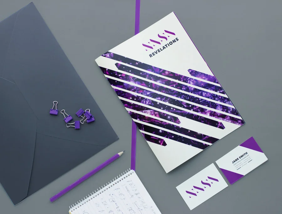
Rebrand exercise: NASA

The brief was to hypothetically revolutionise the wordmark logo of an existing brand, and carry the concept through a 12 page booklet.

I chose NASA, and although I discovered this has been done by many student designers before me, the challenge of the project interested me.

NASA's goal to 'reveal the unknown' provided a starting place, and I began to sketch out ideas using the structure of the original serif typeface.

The booklet was designed to be a educational pamphlet to encourage high school children to consider a future in science with NASA.  A challenging constraint was that we needed to generate our own images for the project. I set about solving this problem of not having access to the Mars Rover and interstellar photography equipment by using visual metaphor, humour and kitchen science.